Stellar Nursery in a Walk-In Closet. One Room Challenge Spring 2019-REVEAL
Reveal day is here!
6 weeks of hard work can really transform so much! But before I show you the result, let me give you a brief summary on this room just in case you are just tuning in for the first time. For this One Room Challenge I decided to re-design my walk in closet so it would accommodate a nursery. At first I was feeling a little guilty to be honest, as if our baby was Harry Potter living under the stairs. However after finishing this room I feel so relieved that I trusted my gut to go with this crazy idea.
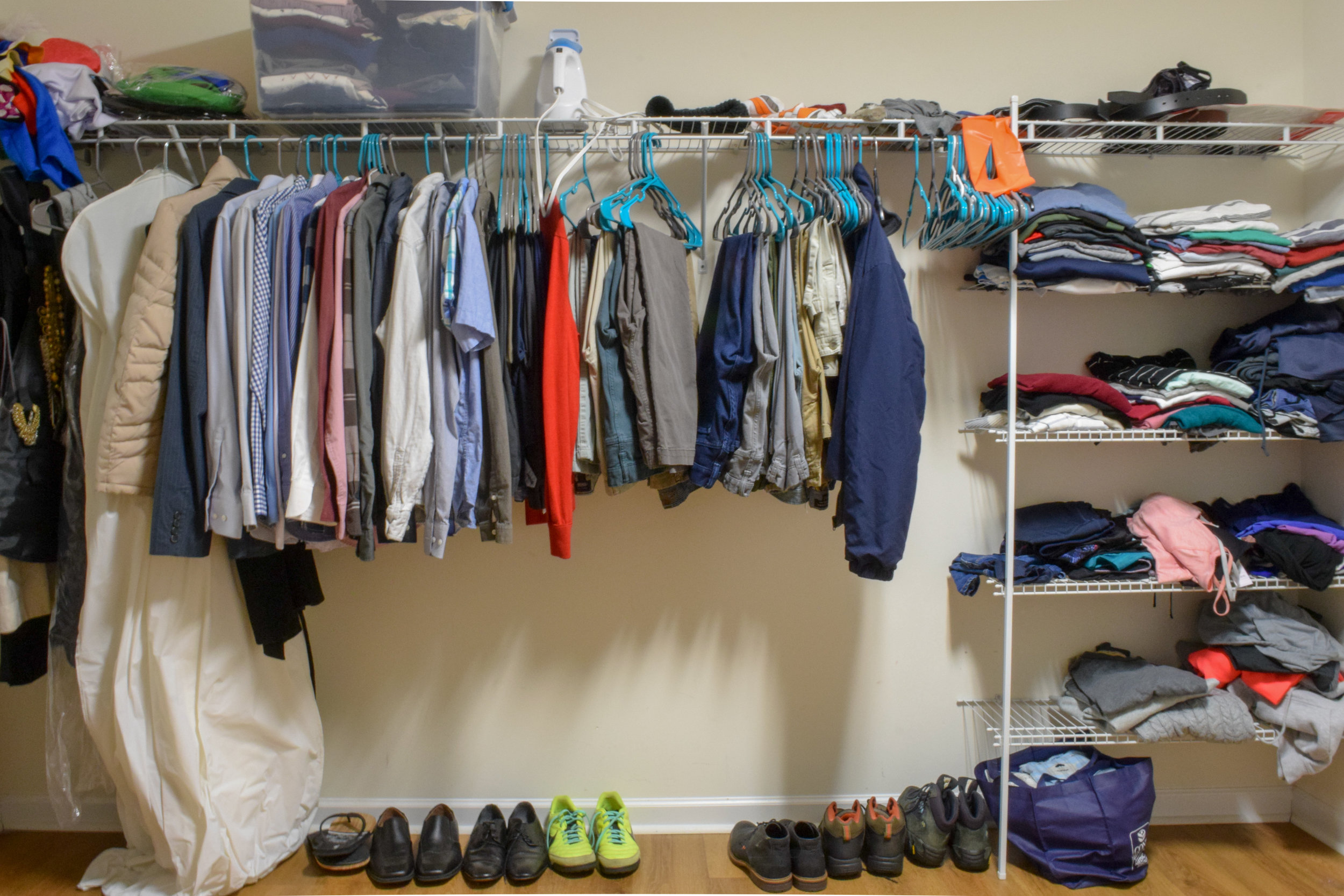
Here we go! Are you ready? This is the before, basically the closet had a wire rack system all around the walls for hanging and a small area with shelves.
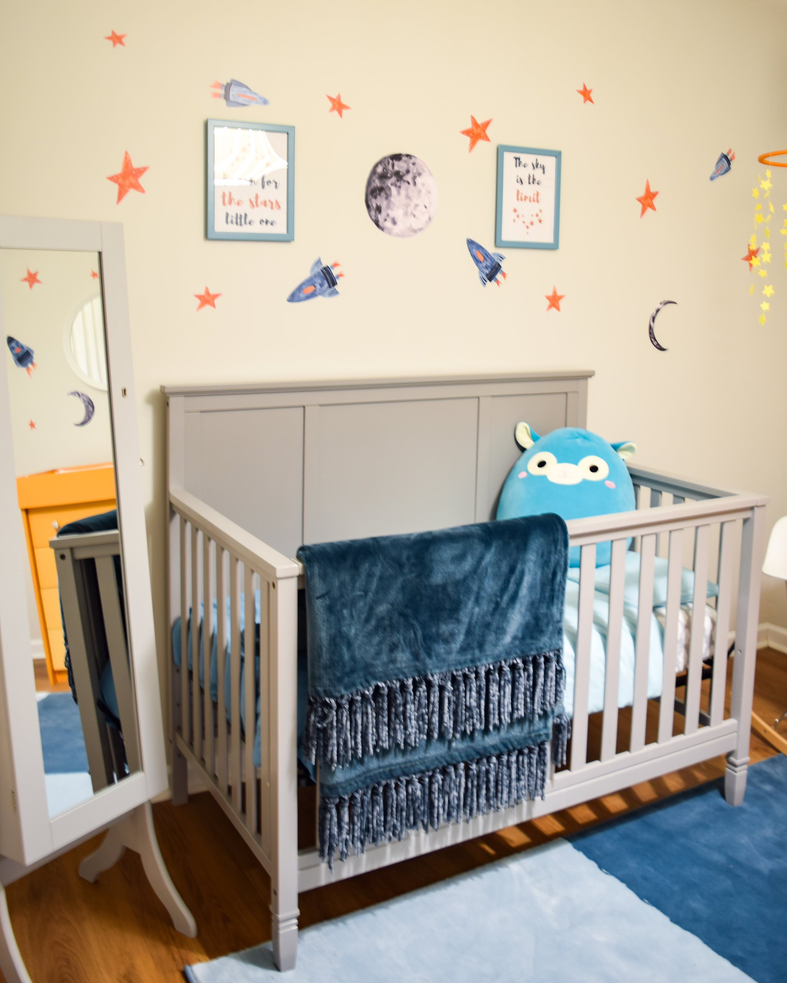
And now… drumroll please! The closet is also a nursery with plenty of space for clothing and for our baby boy.
Where is the closet? Let me show you a really neat trick that I came up with, I like to think it’s magic…
The space is perfect and functional and the curtains allow us to transform the room in just 5 seconds. This project was a win win for everyone, let me walk you through the perks of this closet. I am beyond thrilled with the result!
I found this PAX wardrobe from IKEA and immediately fell in love with it. The size was perfect for the room and it has so many features which allowed us to fit all of our clothes and shoes. The closet now has drawers, plenty of space to hang dresses and shirts, a double shoe rack for each of us and now we can fit two pairs of pants on each hanger. Also, we were able to fit 4 hampers in the wardrobe which saved a lot of space in the room. Did I mention all of these features have a soft close? I mean… it’s so cool. Take a look below:
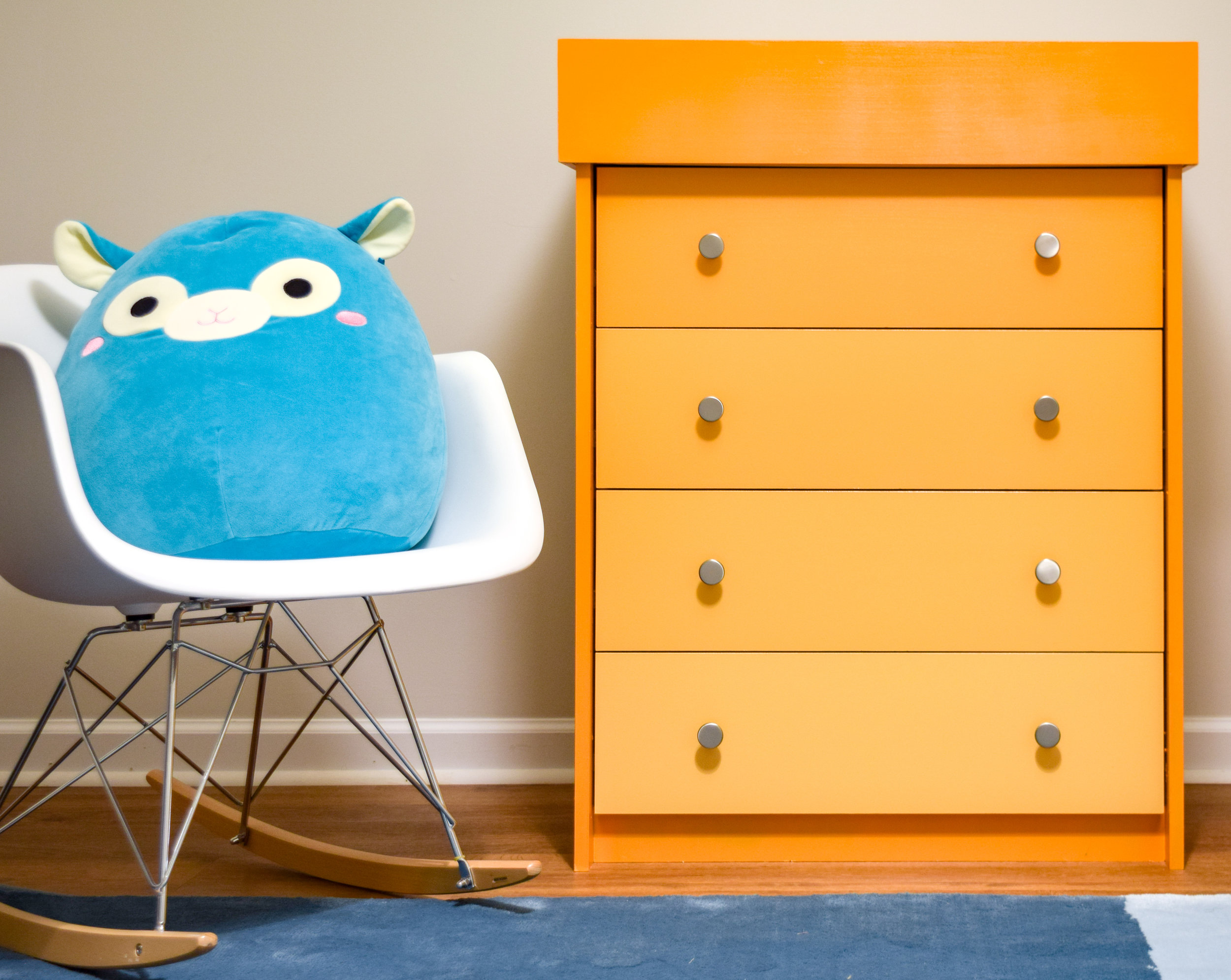
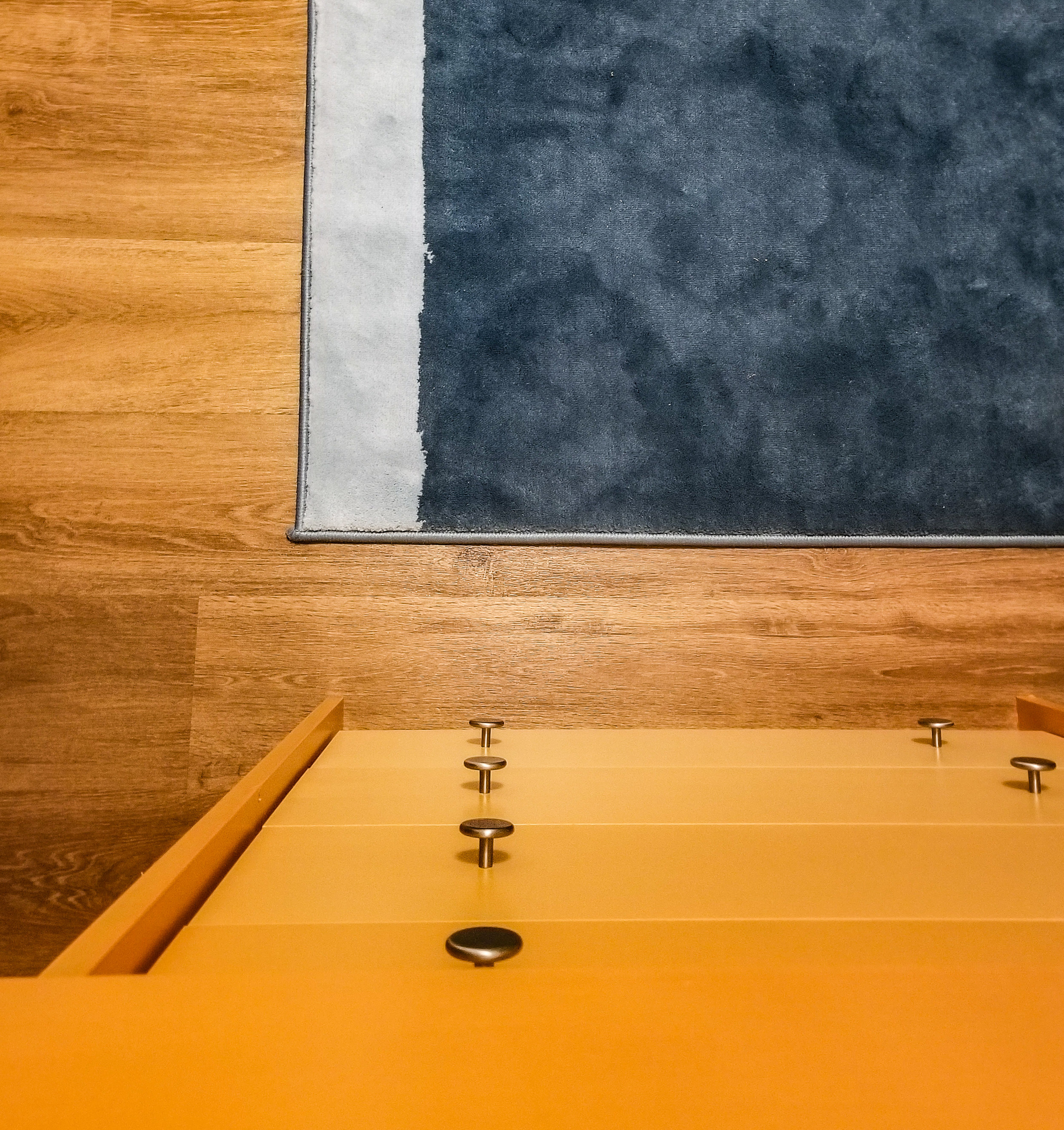
Now let’s move on to the nursery. All the nursery furniture was reused, and the dresser was repurposed as a changing table. You can read more about this on my previous post, but the idea was to give the room some color with this ombre orange and create an accent piece using as little space as possible.
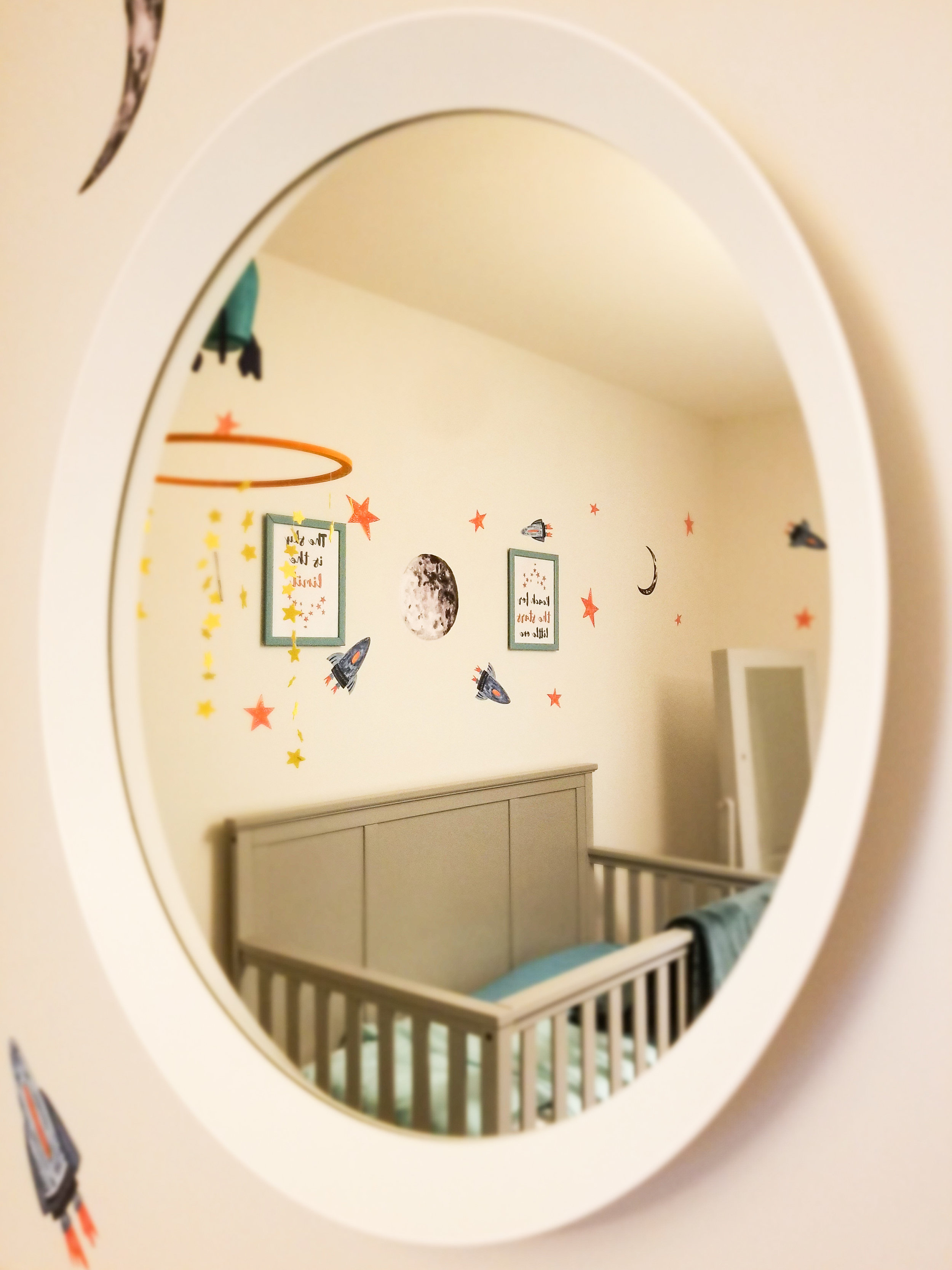
As for the decor, I went with these Wayfair decals from Urban Walls to give the room even more color and dimension. I didn’t want to go with anything permanent since it will only be a nursery until the baby can move in with his big brother. Also the color for the wall was meant to be light since the closet does not have any windows to help the room feel airy and open.
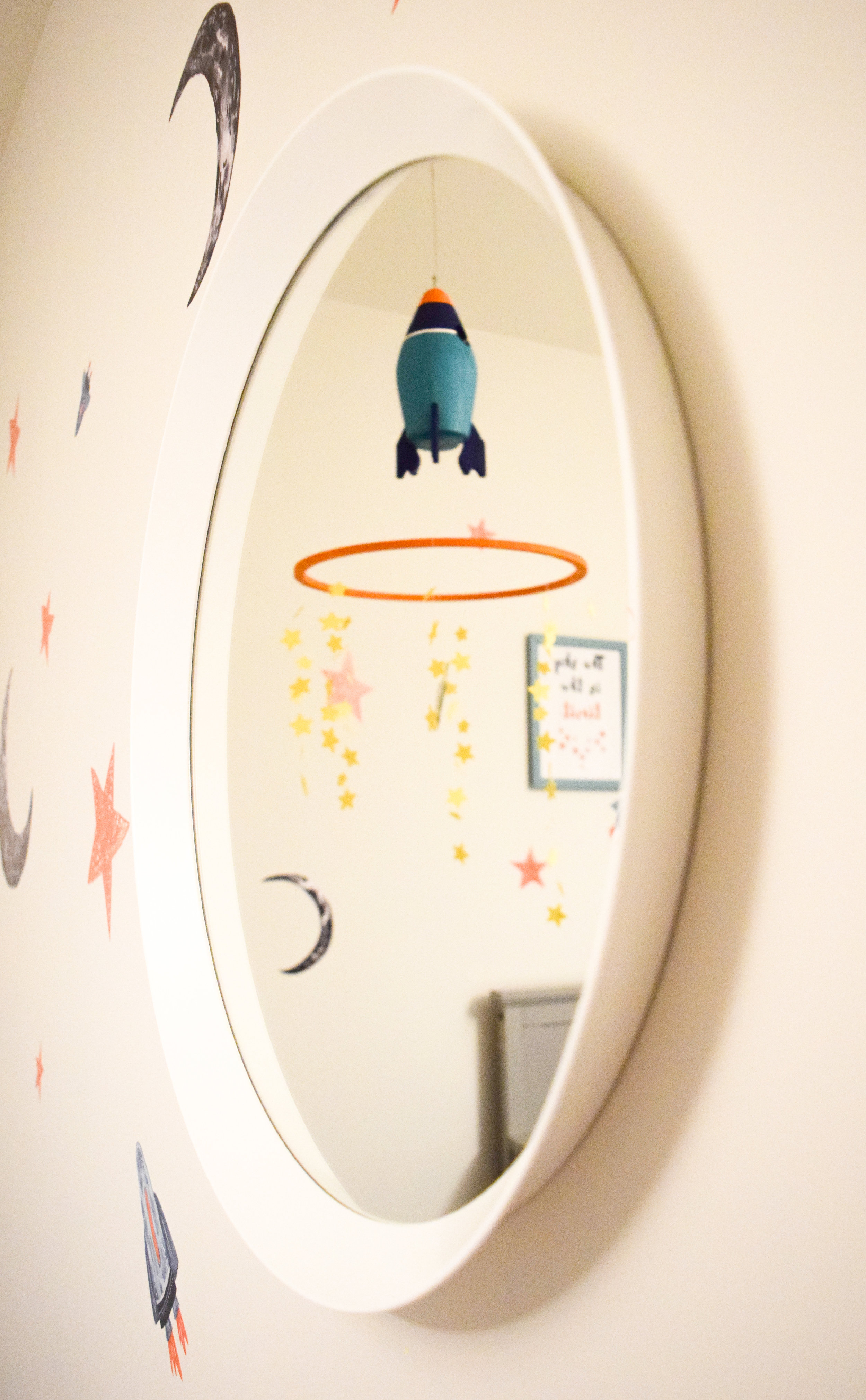
I used 2 mirrors to make the room appear bigger than it really is, perception is everything for this small space.
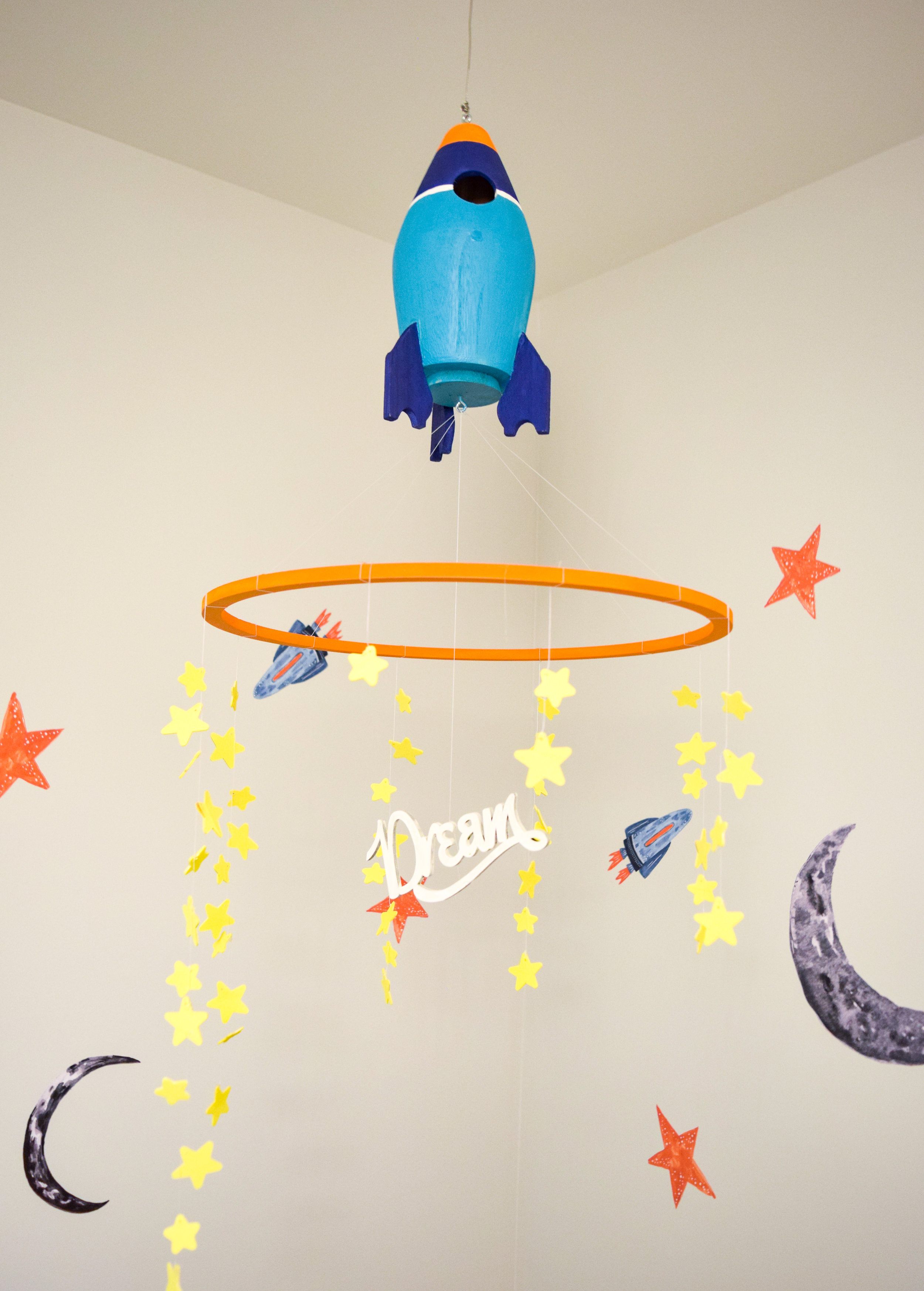
Another DIY project that I did was the mobile in the corner of the room. I found this rocket ship in Michaels, it’s meant to be a birdhouse but I saw it as a opportunity to decorate. This was a such a cute and loving project because my 4 year old daughter was able to help me make it. In a way this room has brought out so much love from the whole family, even my youngest has helped put it together by placing some decals on the wall. It’s the first project I have ever done where everyone wants to chip in and help, so much love for our little boy.
I hope you enjoyed this stellar transformation as much as I did! Leave your comments in the section below and let me know if there’s anything you would like to know more about.
If you haven’t seen the featured designers’ reveals you should definitely go and check them out. Don’t forget to read the rest of the guest participants and congratulate them on their great work.
Be stellar!
Tina


